PREHEADER TEXT GOES HERE
| Option 1: Image-Based Approach |
|
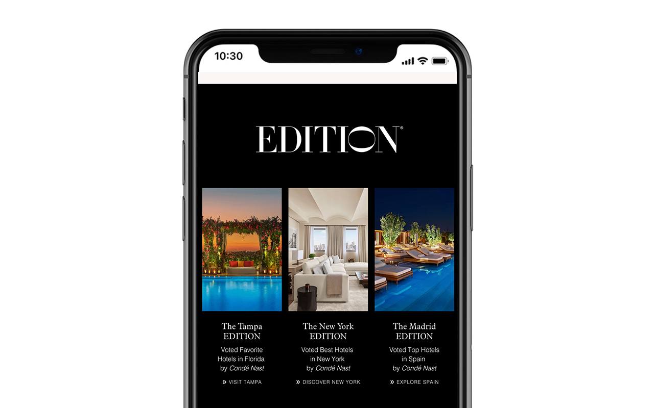
This is Data-Axle's recommended approach for building LUX MAU November. This approach would 1) reduce the scroll length in mobile view and 2) trim code weight. The desktop and mobile views are mocked up above. This approach does not prevent clipping. Given the amount of content, the design may still clip.
Instead of each element being on a separate coded table row (image, headline, body copy, CTA) the design is built in Photoshop and sliced out. The animation will remain. The text will be flattened, meaning it is no longer able to be copied or highlighted. The entire "slice" is inserted into the template, and clicking anywhere on the slice takes you to the property page.
|
|
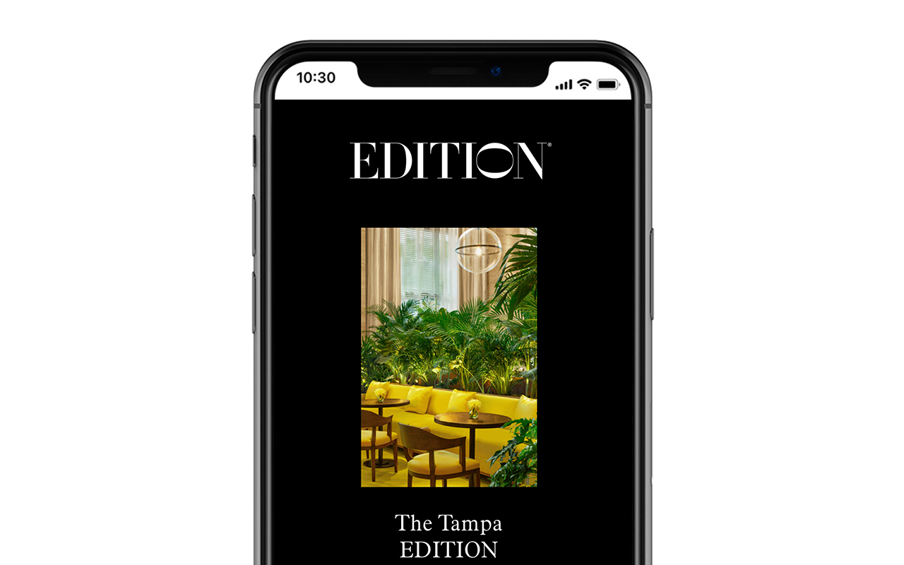
| Option 2: Standard Template Approach |
|
This is how our 3-across is built in our template. It has live text you can highlight. Each element (image, headline, body copy, CTA) are within their own table row. In mobile view, the three properties center-align stack one after another. The desktop and mobile views are mocked up above.
We are proposing Option 1 for LUX MAU November to reduce the scroll. Having the 18 properties stack in center-alignment for mobile view would make for a very long and code-heavy email.
For Both:
Both approaches appear the same in desktop.
The mobile view is a mockup. The acutal mobile view would have animated images.
|
|
|
|